
If you have ever typed “lime green hex code” into Google, you were probably expecting a quick answer. You want the code, you want it to work in your project, and you want to move on with your day. This guide gives you that answer immediately, then goes further by clearing up a confusion that trips up almost every designer at some point: the difference between lime, lime green, and the dozen or so shades that get lumped under the same name.
By the end of this article, you will know the exact hex code for lime green, how it converts to RGB, CMYK, and HSL, which colors pair with it beautifully, and how to use it in a way that keeps your design accessible and readable for everyone.
What Is the Lime Green Hex Code
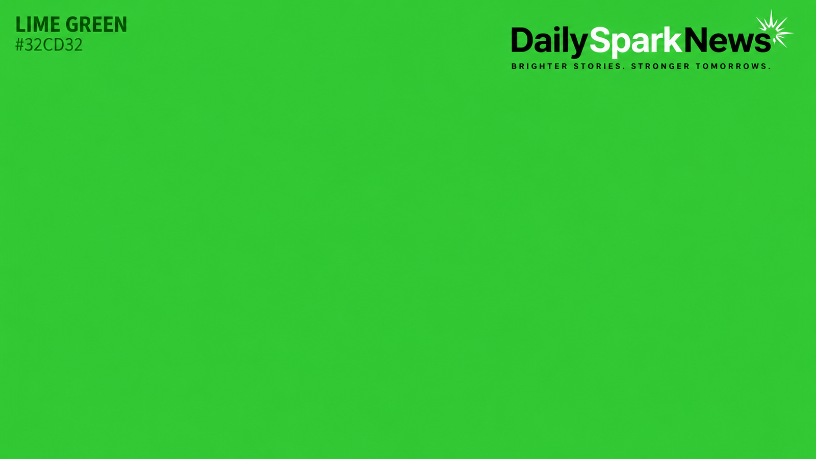
The standard hex code for lime green is #32CD32. This is the value recognized in the CSS color specification under the name “limegreen,” which means you can call it directly by name in your stylesheets without even typing the hex value.
Lime green sits between yellow green and yellow on the color wheel, giving it that bright, slightly warm, citrus like quality. It is often described as the color of a ripe lime peel, though the fruit itself tends to lean a touch more yellow in real life.
Here is the quick reference you came for:
- Hex code:
#32CD32 - Common name in CSS: limegreen
- Color family: green, with a yellow undertone
Keep this code handy, because the rest of this guide builds on it.
Lime Green in RGB, CMYK, and HSL
Different design tools ask for color values in different formats. Knowing how #32CD32 translates across formats saves you from guessing or running back to a converter every time you switch software.
RGB Value
In RGB, which is used for screens and digital displays, lime green breaks down to:
- Red: 50
- Green: 205
- Blue: 50
Notice how the green channel dominates while red and blue sit at equal, lower values. That balance is exactly what gives lime green its vivid, punchy character rather than a muddier olive tone.
CMYK Value
For print work, you will need the CMYK equivalent:
- Cyan: 76%
- Magenta: 0%
- Yellow: 76%
- Black (Key): 20%
If you are printing marketing materials, packaging, or signage, always test a physical proof. CMYK printing can shift slightly depending on paper stock and printer calibration, so what looks perfect on screen may need small adjustments once it hits paper.
HSL Value
In HSL terms, which many designers find more intuitive for adjusting brightness and saturation:
- Hue: 120 degrees
- Saturation: 61%
- Lightness: 50%
If you want a softer, pastel version of lime green, lower the saturation. If you want something bolder and more neon, push the saturation closer to 100% and lower the lightness slightly.
Lime Green vs Lime: Why People Confuse Them
Here is something most articles gloss over, and it causes real headaches for designers: lime and lime green are not the same color.
The CSS named color “lime” is actually hex #00FF00, a pure, saturated green with zero red or blue. It is essentially the brightest possible green a screen can display.
“Lime green,” on the other hand, is the softer, more balanced #32CD32 discussed above. It has noticeably less intensity and reads as more natural, less electric.
If you have ever asked a developer for “lime” and received something far more neon than expected, this naming overlap is usually the reason. When briefing a designer or developer, always specify the hex code rather than relying on the color name alone. It removes any ambiguity and saves revision time later.
Popular Lime Green Shade Variations
Lime green is not a single fixed point. Depending on the brand, tool, or context, you will encounter several close relatives:
- Light lime green (#B9FF66): A pastel, airy version often used in wellness and lifestyle branding.
- Bright lime green (#65FE08): A near neon shade popular in gaming interfaces and sportswear.
- Yellow green (#9ACD32): A more muted, earthy cousin that leans toward olive.
- Chartreuse (#7FFF00): Sitting closer to yellow than green, often confused with lime green in casual conversation.
Each of these serves a different mood. Light lime green feels fresh and approachable. Bright lime green feels urgent and energetic. Choosing the right one depends entirely on the emotional tone you want your design to carry.
Where Lime Green Comes From and Why It Feels So Energetic
Lime green as a named color entered common English usage around the late 1800s, inspired directly by the citrus fruit. It has moved in and out of fashion in distinct waves.
It found a home in the bold, optimistic design language of the 1950s and 1960s, then resurfaced strongly during the 1990s and 2000s as a favorite for tech products, sportswear, and youth focused branding. More recently, it has seen renewed popularity in eco conscious and wellness branding, largely because green already signals nature and sustainability, while the yellow undertone adds a sense of optimism and energy.
Psychologically, lime green is associated with vitality, freshness, and confidence. It grabs attention quickly, which is exactly why you see it so often in call to action buttons, fitness apps, and youth oriented products. Used sparingly, it energizes a design. Used everywhere, it can overwhelm the eye, so restraint matters.
How to Use Lime Green in Web and Graphic Design
Lime green works best as an accent rather than a dominant background, especially in digital interfaces. Here are practical ways designers put it to use.
Highlighting Interactive Elements
Buttons, links, and call to action elements benefit from lime green’s high visibility. Against a neutral background like white, black, or gray, it draws the eye almost instantly, which is valuable for guiding users toward a specific action.
Building Visual Hierarchy
Because lime green stands out so clearly, it works well as a marker for the single most important element on a page. Overusing it on multiple elements dilutes that effect, so many experienced designers reserve it for just one or two focal points per screen.
Creating an Energetic Brand Feel
Health, wellness, fitness, and creative technology brands often lean on lime green to communicate energy and innovation. Paired thoughtfully with cooler tones, it feels fresh rather than aggressive.
Balancing With Neutral Tones
Lime green rarely needs to stand alone. Pairing it with soft grays, deep navy, charcoal, or off white backgrounds keeps the palette from feeling chaotic while still letting the lime green pop.
Accessible Color Pairings for Lime Green
Accessibility is where a lot of lime green designs go wrong, and it is something most color reference pages skip entirely. Because lime green sits at a high lightness level, it does not always provide enough contrast against light backgrounds for text to remain readable.
Here is what you need to know before using it for text or small UI elements:
- Lime green text on a white background generally fails accessibility contrast standards and should be avoided for body copy.
- Lime green text on a black background performs much better, often meeting or exceeding accessibility guidelines for large text and headings.
- For small text sizes, it is safer to use lime green as a background block with black or very dark text placed on top, rather than the reverse.
If you are building anything for the web, run your specific color combination through a contrast checking tool before finalizing it. Accessibility guidelines are measured in exact contrast ratios, and even small shifts in shade can push a combination from passing to failing.
Complementary and Analogous Palettes
Pairing lime green thoughtfully makes the difference between a design that feels intentional and one that feels chaotic.
Complementary Pairing
The direct complementary color to lime green sits in the purple to violet range. A deep purple or plum tone alongside lime green creates strong visual contrast and works especially well for bold, creative branding.
Analogous Pairing
Colors sitting close to lime green on the wheel, such as spring green and yellow, create a softer, more harmonious palette. This combination suits nature focused or wellness branding that wants energy without harsh contrast.
Neutral Grounding Palette
For a more commercial, professional look, pair lime green sparingly with charcoal gray, off white, and a muted navy. This keeps the palette grounded while still giving lime green room to act as the standout accent.
Code Snippets for Developers
If you are implementing lime green directly in your project, here are ready to use formats.
CSS:
.lime-green-bg {
  background-color: #32CD32;
}

.lime-green-text {
  color: #32CD32;
}
You can also reference it by name in CSS without the hex value, since limegreen is a recognized standard color keyword.
SCSS variable:
$lime-green: #32CD32;Tailwind custom color (add to your config):
colors: {
  'lime-green': '#32CD32',
}
Having the value stored as a variable or token means you only need to update it in one place if your brand palette ever shifts slightly, rather than hunting through every file.
Conclusion
Lime green’s hex code is #32CD32, translating to RGB values of 50, 205, 50 and CMYK values of 76%, 0%, 76%, and 20% black. It is a distinct shade from the CSS color simply named “lime,” which is a much brighter #00FF00, so always confirm the exact hex code when briefing a project to avoid mismatched expectations.
Used well, lime green brings energy, freshness, and confidence to a design, especially as an accent against neutral backgrounds. Just remember to check contrast ratios before using it for text, and consider pairing it with deep purples for bold contrast or soft greens and yellows for a gentler, more natural feel.
Whether you are coding a button, designing a logo, or building a full brand palette, you now have everything you need to use lime green correctly, confidently, and accessibly.
Frequently Asked Questions
What is the exact hex code for lime green?
The standard hex code for lime green is #32CD32, which also corresponds to the CSS color name “limegreen.”
Is lime green the same as the color simply called lime?
No. Lime is #00FF00, a much brighter and more saturated green, while lime green at #32CD32 is softer and more balanced.
What colors go well with lime green?
Deep purple creates strong complementary contrast, while spring green and yellow create a softer, more natural analogous palette. Neutral tones like charcoal and off white also ground it well.
Is lime green accessible for website text?
Lime green text on white backgrounds often fails accessibility contrast standards. It performs much better as a background color with black text on top, or as text on a black background.
What is the CMYK value of lime green for printing?
Lime green converts to approximately 76% cyan, 0% magenta, 76% yellow, and 20% black in CMYK, though it is always best to check a physical print proof since results can vary by printer and paper stock.
